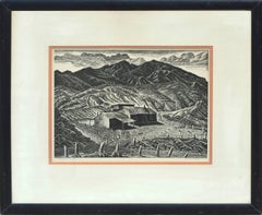


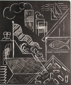
Carol Summers"Krishna Steals the Gopis Clothes, " Abstract Landscape, Signed1981
1981
About the Item
- Creator:Carol Summers (1925 - 2016, American)
- Creation Year:1981
- Dimensions:Height: 42.25 in (107.32 cm)Width: 42.125 in (107 cm)
- Medium:
- Period:
- Framing:Frame IncludedFraming Options Available
- Condition:
- Gallery Location:Milwaukee, WI
- Reference Number:
Carol Summers
Carol Summers, one of America's foremost printmakers, was born in Kingston, New York, in 1925. After service in the Second World War in the Pacific, he attended Bard College, where he studied painting under Stefan Hirsch and printmaking with Louis Schanker. Soon after his graduation in 1951, Summers was awarded several prestigious fellowships, one from the Italian government to study in Italy in 1955, two from the Louis Comfort Tiffany Foundation in 1955 and 1960, and another from the John Simon Guggenheim Foundation in 1959. University posts and workshops took him all over the world, and his subject matter is mainly colorful, stylized landscapes of the places that were of special significance to him, such as in Italy, India and Nepal. In 1974, Summers was awarded an honorary doctorate from the Bard College. His work is in numerous prestigious museums internationally including the Museum of Modern Art, Metropolitan Museum of Art, Art Institute of Chicago, Los Angeles County Museum of Art and Accademia Degli Intronati in Siena, Italy.
- ShippingRetrieving quote...Ships From: Milwaukee, WI
- Return PolicyA return for this item may be initiated within 14 days of delivery.
- "Zarathustra, " Abstract Volcano Woodcut signed by Carol SummersBy Carol SummersLocated in Milwaukee, WI"Zarathustra" is an original color woodcut by Carol Summers. The artist signed the piece in the image. This woodcut depicts an erupting volcano in simplified color fields. The editio...Category
Early 2000s Landscape Prints
MaterialsWoodcut
- "The Long White Road, " Landscape Wood EngravingBy Lowell Merritt LeeLocated in Milwaukee, WI"The Long White Road" is an original wood engraving by Lowell Merritt Lee. A long white road stretches past empty barren trees under a cloudy sky. Image: 6" x 5" Framed: 15.37" x 1...Category
1930s American Modern Landscape Prints
MaterialsWoodcut
- "Road to Cripple Creek, Colo., " Wood Engraving by Gerhard H. BakkerLocated in Milwaukee, WI"Road to Cripple Creek, Colo." is an original woodcut print by Gerhardt H. Bakker. Lines full of expression and shape make up every bit of this print, fr...Category
1930s American Modern Landscape Prints
MaterialsWoodcut
- "Milwaukee Harbor, " Wood Engraving by Lowell Merritt LeeBy Lowell Merritt LeeLocated in Milwaukee, WI"Milwaukee Harbor" is an original woodcut print by Lowell Merritt Lee. Different aspects of the milwaukee harbor come together in a collage-like fashion. Image: 6" x 5" Frame: 14.31...Category
1930s American Modern Landscape Prints
MaterialsWoodcut, Engraving
- 'Hyde Park' original woodcut engraving signed by Auguste Louis LepèreBy Auguste Louis LepèreLocated in Milwaukee, WIThe present artwork is an excellent example of the woodcut engravings of Auguste-Louis Lepère (1849 - 1918). He was the son of the sculptor Francois Lepère, and is considered a leade...Category
1860s Realist Figurative Prints
MaterialsWoodcut, Engraving
- 'Narcissus Braziliana' original woodcut & monotype signed by Carol SummersBy Carol SummersLocated in Milwaukee, WIThe present artwork is a vibrant and colorful example of the woodcut prints of Carol Summers. The image is dominated by the form of a red tropical flower, closely cropped around the petals like in the photographs of Imogen Cunningham and the paintings of Georgia O'Keeffe. The playfulness of the image is enhanced by Summers' signature printmaking technique, which allows the ink from the woodblock to seep through the paper, blurring the edges of each form. 9.63 x 11.63 inches, artwork 21 x 23 inches, frame Edition 16/50 in pencil, lower right Titled in pencil, lower right Signed in pencil, lower center Framed to conservation standards using archival materials including 100 percent rag matting, Museum Glass to inhibit fading, and housed in a modern profile gold gilded wood moulding. Carol Summers (1925-2016) has worked as an artist throughout the second half of the 20th century and into the first years of the next, outliving most of his mid-century modernist peers. Initially trained as a painter, Summers was drawn to color woodcuts around 1950 and it became his specialty thereafter. Over the years he has developed a process and style that is both innovative and readily recognizable. His art is known for it’s large scale, saturated fields of bold color, semi-abstract treatment of landscapes from around the world and a luminescent quality achieved through a printmaking process he invented. In a career that has extended over half a century, Summers has hand-pulled approximately 245 woodcuts in editions that have typically run from 25 to 100 in number. His talent was both inherited and learned. Born in 1925 in Kingston, a small town in upstate New York, Summers was raised in nearby Woodstock with his older sister, Mary. His parents were both artists who had met in art school in St. Louis. During the Great Depression, when Carol was growing up, his father supported the family as a medical illustrator until he could return to painting. His mother was a watercolorist and also quite knowledgeable about the different kinds of papers used for various kinds of painting. Many years later, Summers would paint or print on thinly textured paper originally collected by his mother. From 1948 to 1951, Carol Summers trained in the classical fine and studio arts at Bard College and at the Art Students League of New York. He studied painting with Steven Hirsh and printmaking with Louis Schanker. He admired the shapes and colors favored by early modernists Paul Klee (Sw: 1879-1940) and Matt Phillips (Am: b.1927- ). After graduating, Summers quit working as a part-time carpenter and cabinetmaker (which had supported his schooling and living expenses) to focus fulltime on art. That same year, an early abstract, Bridge No. 1 was selected for a Purchase Prize in a competition sponsored by the Brooklyn Museum. In 1952, his work (Cathedral, Construction and Icarus) was shown the first time at the Museum of Modern Art in New York City in an exhibition of American woodcuts. In 1954, Summers received a grant from the Italian government to study for a year in Italy. Woodcuts completed soon after his arrival there were almost all editions of only 8 to 25 prints, small in size, architectural in content and black and white in color. The most well-known are Siennese Landscape and Little Landscape, which depicted the area near where he resided. Summers extended this trip three more years, a decision which would have significant impact on choices of subject matter and color in the coming decade. After returning from Europe, Summers’ images continued to feature historical landmarks and events from Italy as well as from France, Spain and Greece. However, as evidenced in Aetna’s Dream, Worldwind and Arch of Triumph, a new look prevailed. These woodcuts were larger in size and in color. Some incorporated metal leaf in the creation of a collage and Summers even experimented with silkscreening. Editions were now between 20 and 50 prints in number. Most importantly, Summers employed his rubbing technique for the first time in the creation of Fantastic Garden in late 1957. Dark Vision of Xerxes, a benchmark for Summers, was the first woodcut where Summers experimented using mineral spirits as part of his printmaking process. A Fulbright Grant as well as Fellowships from the Louis Comfort Tiffany Foundation and the Guggenheim Foundation followed soon thereafter, as did faculty positions at colleges and universities primarily in New York and Pennsylvania. During this period he married a dancer named Elaine Smithers with whom he had one son, Kyle. Around this same time, along with fellow artist Leonard Baskin, Summers pioneered what is now referred to as the “monumental” woodcut. This term was coined in the early 1960s to denote woodcuts that were dramatically bigger than those previously created in earlier years, ones that were limited in size mostly by the size of small hand-presses. While Baskin chose figurative subject matter, serious in nature and rendered with thick, striated lines, Summers rendered much less somber images preferring to emphasize shape and color; his subject matter approached abstraction but was always firmly rooted in the landscape. In addition to working in this new, larger scale, Summers simultaneously refined a printmaking process which would eventually be called the “Carol Summers Method” or the “ Carol Summers Technique”. Summers produces his woodcuts by hand, usually from one or more blocks of quarter-inch pine, using oil-based printing inks and porous mulberry papers. His woodcuts reveal a sensitivity to wood especially its absorptive qualities and the subtleties of the grain. In several of his woodcuts throughout his career he has used the undulating, grainy patterns of a large wood plank to portray a flowing river or tumbling waterfall. The best examples of this are Dream, done in 1965 and the later Flash Flood Escalante, in 2003. In the majority of his woodcuts, Summers makes the blocks slightly larger than the paper so the image and color will bleed off the edge. Before printing, he centers a dry sheet of paper over the top of the cut wood block or blocks, securing it with giant clips. Then he rolls the ink directly on the front of the sheet of paper and pressing down onto the dry wood block or reassembled group of blocks. Summers is technically very proficient; the inks are thoroughly saturated onto the surface of the paper but they do not run into each other. The precision of the color inking in Constantine’s Dream in 1969 and Rainbow Glacier in 1970 has been referred to in various studio handbooks. Summers refers to his own printing technique as “rubbing”. In traditional woodcut printing, including the Japanese method, the ink is applied directly onto the block. However, by following his own method, Summers has avoided the mirror-reversed image of a conventional print and it has given him the control over the precise amount of ink that he wants on the paper. After the ink is applied to the front of the paper, Summers sprays it with mineral spirits, which act as a thinning agent. The absorptive fibers of the paper draw the thinned ink away from the surface softening the shapes and diffusing and muting the colors. This produces a unique glow that is a hallmark of the Summers printmaking technique. Unlike the works of other color field artists or modernists of the time, this new technique made Summers’ extreme simplification and flat color areas anything but hard-edged or coldly impersonal. By the 1960s, Summers had developed a personal way of coloring and printing and was not afraid of hard work, doing the cutting, inking and pulling himself. In 1964, at the age of 38, Summers’ work was exhibited for a second time at the Museum of Modern Art. This time his work was featured in a one-man show and then as one of MoMA’s two-year traveling exhibitions which toured throughout the United States. In subsequent years, Summers’ works would be exhibited and acquired for the permanent collections of multiple museums throughout the United States, Europe and Asia. Summers’ familiarity with landscapes throughout the world is firsthand. As a navigator-bombardier in the Marines in World War II, he toured the South Pacific and Asia. Following college, travel in Europe and subsequent teaching positions, in 1972, after 47 years on the East Coast, Carol Summers moved permanently to Bonny Doon in the Santa Cruz Mountains in Northern California. There met his second wife, Joan Ward Toth, a textile artist who died in 1998; and it was here his second son, Ethan was born. During the years that followed this relocation, Summers’ choice of subject matter became more diverse although it retained the positive, mostly life-affirming quality that had existed from the beginning. Images now included moons, comets, both sunny and starry skies, hearts and flowers, all of which, in one way or another, remained tied to the landscape. In the 1980s, from his home and studio in the Santa Cruz mountains, Summers continued to work as an artist supplementing his income by conducting classes and workshops at universities in California and Oregon as well as throughout the Mid and Southwest. He also traveled extensively during this period hiking and camping, often for weeks at a time, throughout the western United States and Canada. Throughout the decade it was not unusual for Summers to backpack alone or with a fellow artist into mountains or back country for six weeks or more at a time. Not surprisingly, the artwork created during this period rarely departed from images of the land, sea and sky. Summers rendered these landscapes in a more representational style than before, however he always kept them somewhat abstract by mixing geometric shapes with organic shapes, irregular in outline. Some of his most critically acknowledged work was created during this period including First Rain, 1985 and The Rolling Sea, 1989. Summers received an honorary doctorate from his alma mater, Bard College in 1979 and was selected by the United States Information Agency to spend a year conducting painting and printmaking workshops at universities throughout India. Since that original sabbatical, he has returned every year, spending four to eight weeks traveling throughout that country. In the 1990s, interspersed with these journeys to India have been additional treks to the back roads and high country areas of Mexico, Central America, Nepal, China and Japan. Travel to these exotic and faraway places had a profound influence on Summers’ art. Subject matter became more worldly and non-western as with From Humla to Dolpo, 1991 or A Former Life of Budha, 1996, for example. Architectural images, such as The Pillars of Hercules, 1990 or The Raja’s Aviary, 1992 became more common. Still life images made a reappearance with Jungle Bouquet in 1997. This was also a period when Summers began using odd-sized paper to further the impact of an image. The 1996 Night, a view of the earth and horizon as it might be seen by an astronaut, is over six feet long and only slightly more than a foot-and-a-half high. From 1999, Revuelta A Vida (Spanish for “Return to Life”) is pie-shaped and covers nearly 18 cubic feet. It was also at this juncture that Summers began to experiment with a somewhat different palette although he retained his love of saturated colors. The 2003 Far Side of Time is a superb example of the new direction taken by this colorist. At the turn of the millennium in 1999, “Carol Summers Woodcuts...Category
Early 2000s Contemporary Landscape Prints
MaterialsMonotype, Woodcut

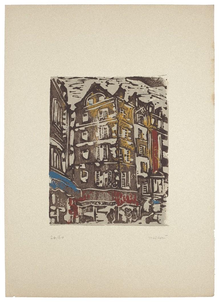
- Houses - Woodcut by Carlo Mazzoni - 1977By Carlo MazzoniLocated in Roma, ITHouses in the city is an original woodcut realized by Carlo Mazzoni. Hand-signed by the artist in pencil on the lower right corner. Numbered on the lower-left corner. Edition 24/60....Category
1970s Figurative Prints
MaterialsWoodcut
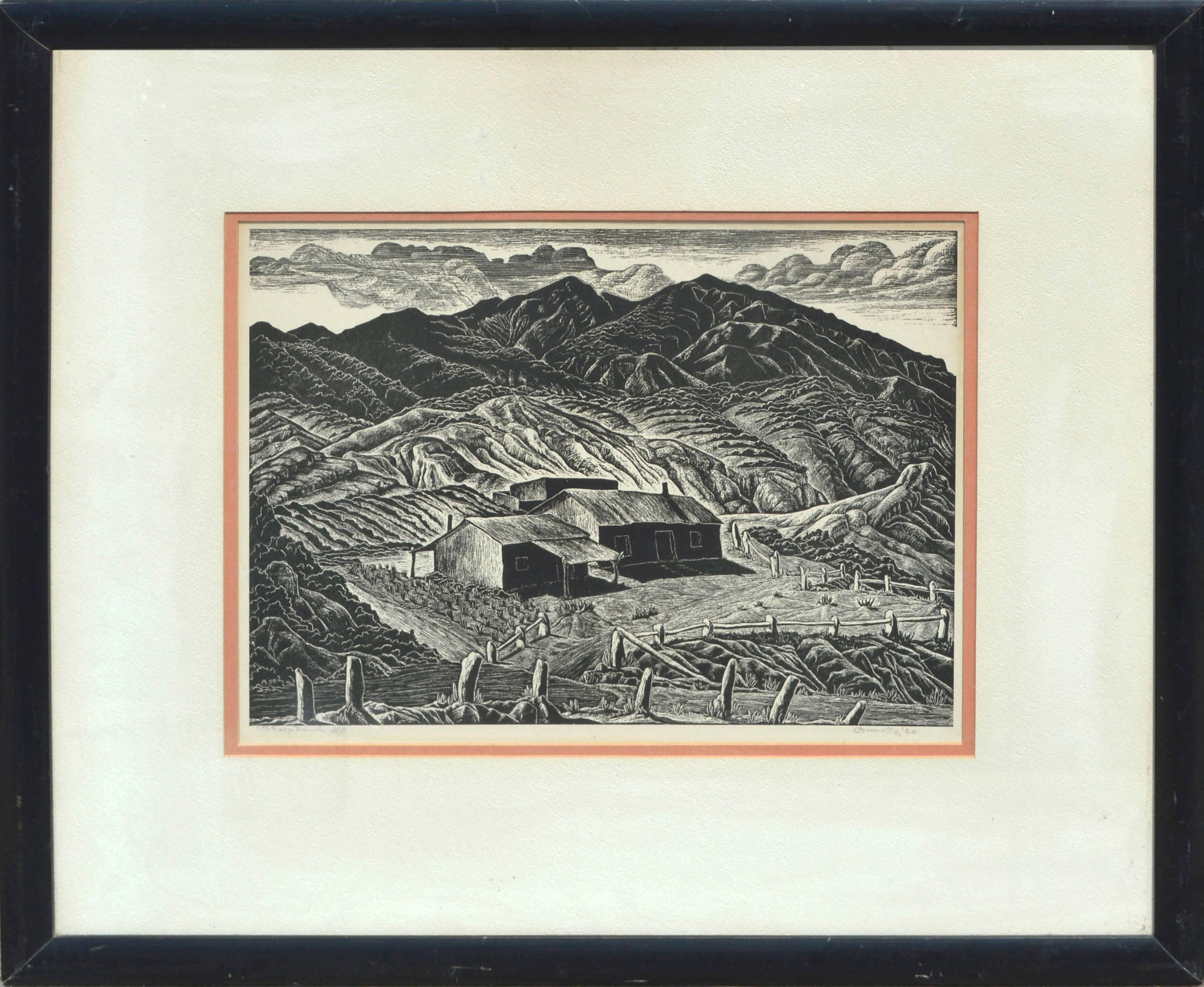
- Mid Century Sheep Ranch Landscape WoodblockBy Ina AnnetteLocated in Soquel, CABeautifully detailed woodblock print in the style of Berger Sandzen her teacher, titled "Sheep Ranch" by Ina Agnes Annette (American, 1901-1991), 1950. Signed and dated lower right. Titled and numbered #2/320 on left. Presented in painted wood frame. Shipped without glass. Image size: 11"H x 14"W. Framed size: 21"H x 23"W. Painter of landscapes, book illustrator, and graphic artist, Ina Annett was born in Cleveland, Oklahoma, and moved to Norman, where she was an art teacher at the University of Oklahoma and member of the Oklahoma Art Association. She was a student of BErger Sandzen, Oscar Brousse Jacobsen and George Bridgman and exhibited with the Denver Art Club and the Oklahoma State Fair. Her mediums were oil, watercolor, batik, block printing and lithography. Book illustrations include Folk Say 1930, edited by Ben Botkin; and Forgotten Frontiers by Alfred B Thomas. Indicative of the fact that she was one of the early painters in the Southwest is her 1939 painting...Category
1950s American Impressionist Landscape Prints
MaterialsPaper, Ink, Woodcut
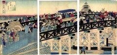
- Nihonbashi Bridge - Woodcut Print by Utagawa Yoshitora - 1875By Utagawa YoshitoraLocated in Roma, ITScene on the Nihonbashi Bridge is an artwork realized in 1875 by Utagawa Yoshitora. Woodcut print triptych. Signed: Mosai ga. Publisher: Sawamuraya...Category
1870s Modern Figurative Prints
MaterialsWoodcut
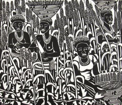
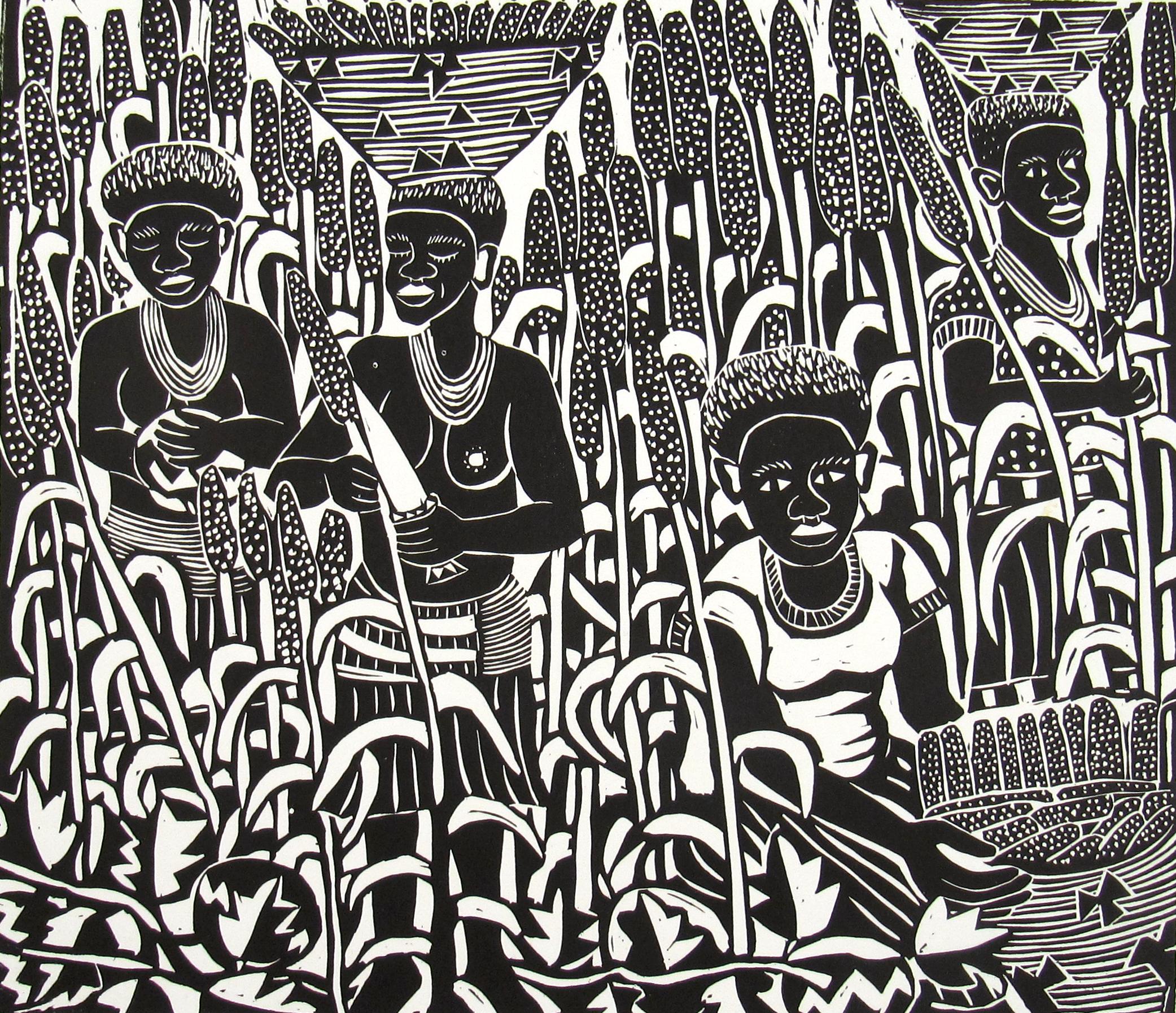
- Elia Shiwoohamba ( Namibia, 1981 ) Harvesting Time Lino Cut African School 2006By Elia ShiwoohamaLocated in Meinisberg, CHElia Shiwoohamba (* 1981 , Windhoek, Namibia ) Harvesting Time • African School • Linoleum cut • Sheet ca. 34.5 x 43 cm (Image is smaller) • Bottom left numbered 8/50 and titled • ...Category
Early 2000s Expressionist Landscape Prints
MaterialsPaper, Linocut, Woodcut
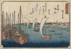
- Takanawa no Kihan - Woodblock print by Utagawa Hiroshige - 1843-1847By Utagawa HiroshigeLocated in Roma, ITTakanawa no kihan is a modern artwork realized between 1843 and 1847 after Utagawa Hiroshige. Ukiyo-e color woodblock print from the Touto hakkei (The Eight Famous Views of the Capital of the East) series. Mounted under passepartout. The artwork depicts the port of Takanawa, a suburb of Minato in southern Tokyo, and is one of the very rare sheets by Utagawa Ando Hiroshige...Category
Mid-19th Century Modern Figurative Prints
MaterialsWoodcut
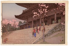
- 'Chion-in Temple Gate' from 'Eight Scenes of Cherry Blossoms' — Jizuri SealBy Hiroshi YoshidaLocated in Myrtle Beach, SCHiroshi Yoshida, 'Chion-in Temple Gate (Sunset)' from the series 'Eight Scenes of Cherry Blossoms (Sakura hachi dai: Sakura mon)', color woodblock print, 1935. Signed in brush 'Yoshida' and in pencil 'Hiroshi Yoshida'. A superb, early impression, with fresh colors; the full sheet with margins, on cream Japan paper; an area of slight toning in the top right sheet corner, not affecting the image, otherwise in excellent condition. Marked with a jizuri (self-printed) seal, upper left margin. Self-published by the artist. Image size 9 5/8 x 14 3/4 inches (444 x 375 mm); sheet size 10 7/8 x 16 inches (276 x 406 mm). Archivally sleeved, unmatted. Provenance: M. Nakazawa, Tokyo. Literature: Japanese Landscapes of the 20th century (Hotei Publishing calendar), 2001, May. Collections: Honolulu Museum of Art, Museum of Fine Arts, Boston. ABOUT THE IMAGE Located in Kyoto, Chionin is the main temple of the Jodo sect of Japanese Buddhism, one of the most popular Buddhist sects in Japan, having millions of followers. The Sanmon Gate, Chionin's entrance gate, standing 24 meters tall and 50 meters wide, it is the largest wooden temple gate in Japan and dates back to the early 1600s. Behind the gate, a wide set of stairs leads to the main temple grounds. ABOUT THE ARTIST Painter and printmaker Yoshida Hiroshi (1876-1950) is regarded as one of the greatest artists of the Japanese 'shin hanga' (New Print) movement. Yoshida was born as the second son of Ueda Tsukane in Kurume, Fukuoka Prefecture, a schoolteacher from an old samurai family. In 1891 he was adopted by his art teacher Yoshida Kasaburo in Fukuoka and took his surname. In 1893 he went to Kyoto to study painting, and the following year to Tokyo to join Koyama Shotaro's Fudosha private school; he also became a member of the Meiji Fine Arts Society. These institutions taught and advocated Western-style painting, greatly influencing Yoshida’s artistic development. In 1899 Yoshida had his first American exhibition at Detroit Museum of Art (now Detroit Institute of Art), making the first of many visits to the US and Europe. In 1902 he helped reorganize the Meiji Fine Arts Society, renaming it the Taiheiyo-Gakai (Pacific Painting...Category
1930s Showa Figurative Prints
MaterialsWoodcut